Create Loan Guided Flow for Brokers
The goal of this PennyMac initiative was to take the next step in creating our own native platforms to service our clients and moving away from using 3rd party applications, eventually redesigning every step of the user experience using our own products. On this project I lead the design efforts for designing our own “Create Loan” experience, replacing the previous 3rd party screens that were being used.
Project
Guided Create Loan Flow
Client
PennyMac Financial Services
Role
UX/UI Design
Challenge
The current create loan process is fragmented, and hard to update and improve due to 3rd party platform restrictions. Users experience a slow product, with redundant screens, lacking of features, and an unclear process that decreases the number of loans Loan Officers or Brokers can service. This experience discourages clients from choosing to do business with us.
Results
Create our own Create Loan process that is fully configurable allowing us to update the process, and still keep within loan regulations guidelines. We want to make an experience that would be easy to follow, quick to complete, and minimize the number of validation errors in the loan creating process. This allows users to create and service more loans, faster.
Design Process
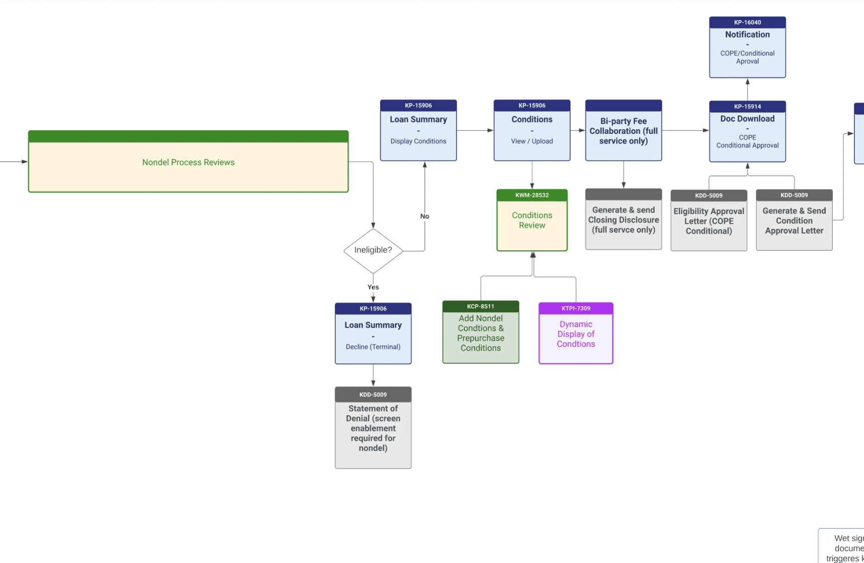
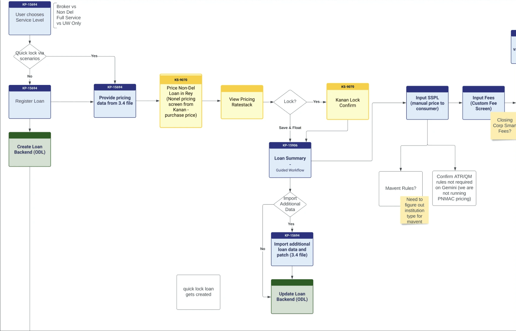
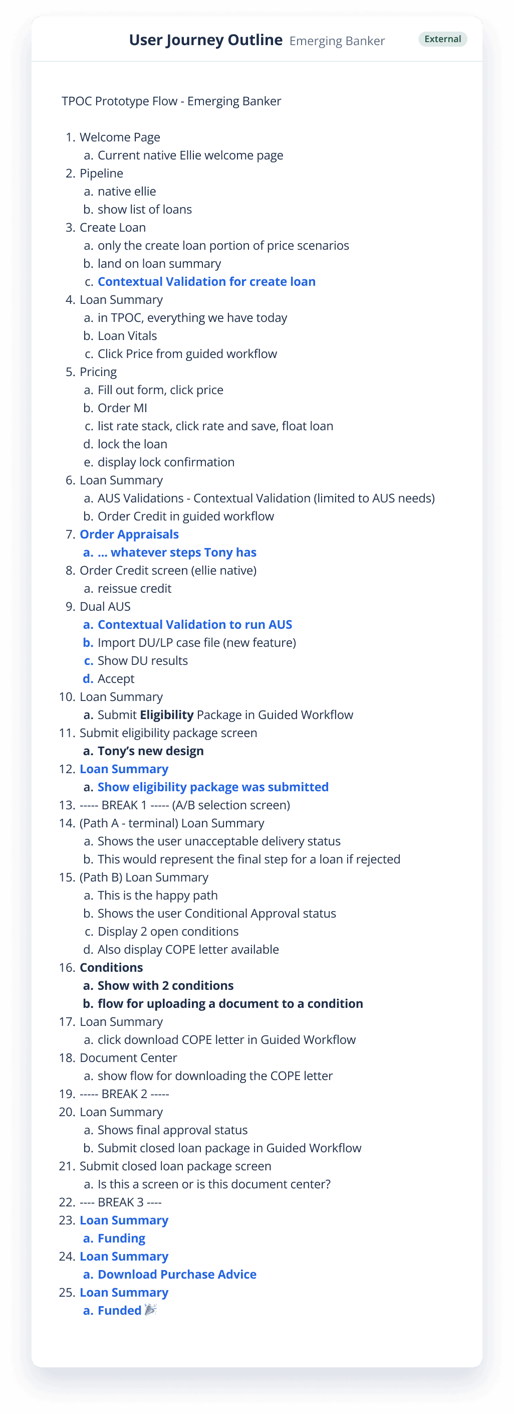
Understand the mapping of the full loan servicing process, and then make a list of what steps a user is going to take in their UX journey, taking note of the conditional logic that could effect the users experience and how to guide them through it.
While there was not much visual consistency across our platforms using the third party software, there was the basis of a design language that users had grown accustomed to. I wanted to establish a more consistent design language that fit the new direction of the company’s focus, software and user experience, but also didn’t want to overwhelm a large client base by introducing too many new elements or completely changing the process.
Iterations
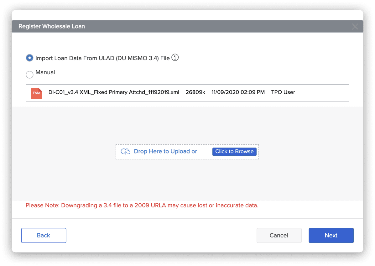
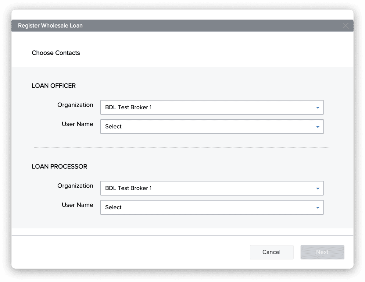
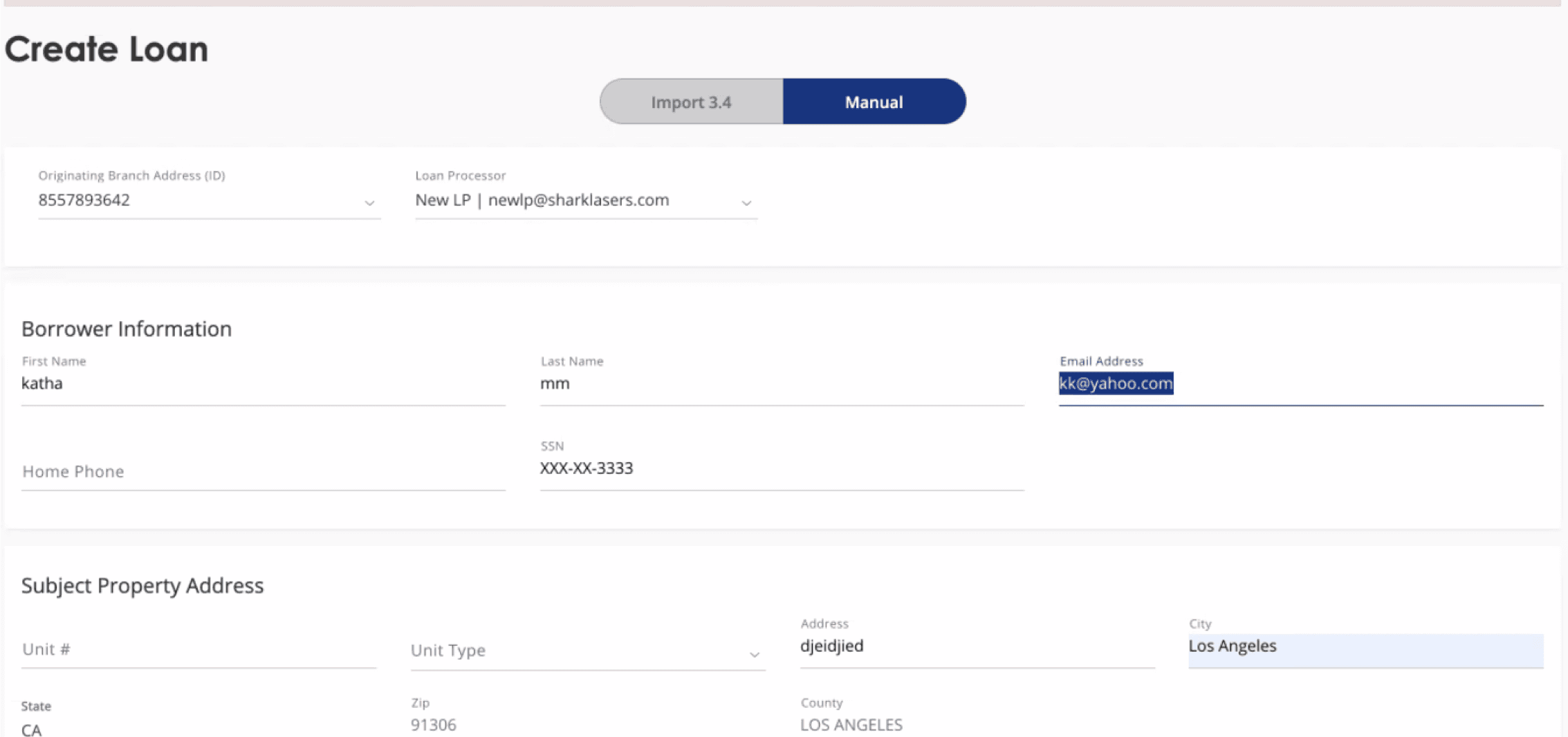
The initial concept was a sort of “guided workflow” idea. A user can populate the guided form with data from an uploaded file, or enter in the required information manually. This was to streamline the process of the loan creation in simplified, sequential steps that would be dynamic depending on some conditional logic. This could keep the user focused on what steps are needed and only present them with prompts to fill out when they are needed. This also helps make sure that all the required data is gathered, as well as minimizing validation errors.

Results
After meetings with the product team and business stakeholders for some feedback, the idea to take this type of guided form workflow and use it for potential future experiences seemed to be worth some exploration. This begged the question, “How do we make this more scalable?” Progress indicators were added to the cards, so that in the future, card steps could be partially completed, and/or completed out of sequence. Especially in longer forms with even more sections and conditional fields, this would give users more clarity and visual indicators on what sections of a form are complete, and where they may need to direct their attention to next.
Project
Guided Create Loan Flow
Client
PennyMac Financial Services
Role
UX/UI Design
Challenge
The current create loan process is fragmented, and hard to update and improve due to 3rd party platform restrictions. Users experience a slow product, with redundant screens, lacking of features, and an unclear process that decreases the number of loans Loan Officers or Brokers can service. This experience discourages clients from choosing to do business with us.
Results
Create our own Create Loan process that is fully configurable allowing us to update the process, and still keep within loan regulations guidelines. We want to make an experience that would be easy to follow, quick to complete, and minimize the number of validation errors in the loan creating process. This allows users to create and service more loans, faster.
Design Process
Understand the mapping of the full loan servicing process, and then make a list of what steps a user is going to take in their UX journey, taking note of the conditional logic that could effect the users experience and how to guide them through it.
While there was not much visual consistency across our platforms using the third party software, there was the basis of a design language that users had grown accustomed to. I wanted to establish a more consistent design language that fit the new direction of the company’s focus, software and user experience, but also didn’t want to overwhelm a large client base by introducing too many new elements or completely changing the process.
Iterations
The initial concept was a sort of “guided workflow” idea. A user can populate the guided form with data from an uploaded file, or enter in the required information manually. This was to streamline the process of the loan creation in simplified, sequential steps that would be dynamic depending on some conditional logic. This could keep the user focused on what steps are needed and only present them with prompts to fill out when they are needed. This also helps make sure that all the required data is gathered, as well as minimizing validation errors.
Results
After meetings with the product team and business stakeholders for some feedback, the idea to take this type of guided form workflow and use it for potential future experiences seemed to be worth some exploration. This begged the question, “How do we make this more scalable?” Progress indicators were added to the cards, so that in the future, card steps could be partially completed, and/or completed out of sequence. Especially in longer forms with even more sections and conditional fields, this would give users more clarity and visual indicators on what sections of a form are complete, and where they may need to direct their attention to next.